|
|
View unanswered posts | View active topics
| Author |
Message |
|
GK Productions
|
 Posted: Posted: Sun Mar 08, 2020 7:11 pm |
|
 |
| Advanced Poster |
 |
Joined: Sat Mar 03, 2018 1:24 am
Posts: 301
Images: 3
Location: Salina,KS
Been Liked: 13 times
|
Alan B wrote: DannyG2006 wrote: DannyG2006 wrote: GK Productions wrote: Alan B wrote: I suppose if I had to use that name, this is the logo that I created and would use. I think it looks better then using the pics that you posted......................... Nice Job ..maybe I need to hire you to do my logo.....but the word needs to be spelled Shattered Glass..left out an e in Shattered,,,,but not bad over all...not bad May people should contact Alan B on here to design their logo Thank you Alan B PS I was was thinking that the glass part would be like a music note exploding.....not sure but a thought How about an apostrophe where that last e should be. Would look cooler in my opinion. This is my logo. It's actually a reverse of my original logo which was black lettering on a white background. Danny, get rid of that "where we make you the star" crap. I like this logo for you alot better then the other
|
|
| Top |
|
 |
|
GK Productions
|
Posted: Sun Mar 08, 2020 7:19 pm |
|
|
| Advanced Poster |
|
Joined: Sat Mar 03, 2018 1:24 am
Posts: 301
Images: 3
Location: Salina,KS
Been Liked: 13 times
|
|
I THINK ALAN B DID A GOOD JOB WITH RECREATING LOGO FOR BOTH MYSELF SHATTERED GLASS KARAOKE...AND STARMAKER...IF YOU WOULD LIKE TO HAVE A LOGO DONE....CONTACT ALAN B...THANK YOU ALAN!!!!!
|
|
| Top |
|
|
|
DannyG2006
|
Posted: Mon Mar 09, 2020 9:04 am |
|
Joined: Sun Nov 27, 2005 11:31 am
Posts: 5355
Location: Watebrury, CT
Been Liked: 397 times
|
Alan B wrote: DannyG2006 wrote: DannyG2006 wrote: GK Productions wrote: Alan B wrote: I suppose if I had to use that name, this is the logo that I created and would use. I think it looks better then using the pics that you posted......................... Nice Job ..maybe I need to hire you to do my logo.....but the word needs to be spelled Shattered Glass..left out an e in Shattered,,,,but not bad over all...not bad May people should contact Alan B on here to design their logo Thank you Alan B PS I was was thinking that the glass part would be like a music note exploding.....not sure but a thought How about an apostrophe where that last e should be. Would look cooler in my opinion. This is my logo. It's actually a reverse of my original logo which was black lettering on a white background. Danny, get rid of that "where we make you the star" crap. Sorry, I like mine better. Not as flashy as your creation but I am quite fond of my own work. And yours is flawed by the fact that StarMaker is one word. It's just separated in mine because I like using the top of the star as the first A in StarMaker. Besides mine looks perfect when dealing with black and white printing. Meaning nothing has to change. I print all of my stuff and the printer only prints in black and white.
_________________
The Line Array Experiment is over. Nothing to see here. Move along.
|
|
| Top |
|
|
|
Alan B
|
Posted: Mon Mar 09, 2020 11:42 am |
|
Joined: Sun Jul 30, 2006 7:24 pm
Posts: 4438
Been Liked: 1048 times
|
DannyG2006 wrote: Sorry, I like mine better. Not as flashy as your creation but I am quite fond of my own work. And yours is flawed by the fact that StarMaker is one word. It's just separated in mine because I like using the top of the star as the first A in StarMaker. Besides mine looks perfect when dealing with black and white printing. Meaning nothing has to change. I print all of my stuff and the printer only prints in black and white. Danny, I'm glad you like the logo you created. As long as it works for you is all that matters... however, in my opinion, the one I created looks much more professional than yours. And it can easily be made in black & white.
| Attachments: |
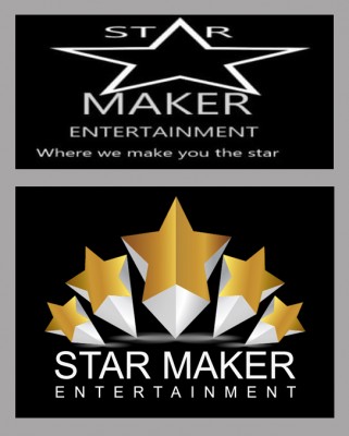
comparison.jpg [ 144.92 KiB | Viewed 23655 times ]
|
_________________
Electro-Voice Evolve 50... Taking Sound To The Next Level.
|
|
| Top |
|
|
|
GK Productions
|
Posted: Mon Mar 09, 2020 12:08 pm |
|
|
| Advanced Poster |
|
Joined: Sat Mar 03, 2018 1:24 am
Posts: 301
Images: 3
Location: Salina,KS
Been Liked: 13 times
|
Alan B wrote: DannyG2006 wrote: Sorry, I like mine better. Not as flashy as your creation but I am quite fond of my own work. And yours is flawed by the fact that StarMaker is one word. It's just separated in mine because I like using the top of the star as the first A in StarMaker. Besides mine looks perfect when dealing with black and white printing. Meaning nothing has to change. I print all of my stuff and the printer only prints in black and white. Danny, I'm glad you like the logo you created. As long as it works for you is all that matters... however, in my opinion, the one I created looks much more professional than yours. And it can easily be made in black & white. Based on the artwork Alans is a lot better..It has more of a professional flair to it...but it up to each person to chose what they like including names..logo..and ect..since it is theirs
|
|
| Top |
|
|
|
Alan B
|
Posted: Mon Mar 09, 2020 12:41 pm |
|
Joined: Sun Jul 30, 2006 7:24 pm
Posts: 4438
Been Liked: 1048 times
|
|
Also Danny....
I would seriously consider getting rid of the "where we make you the star" line. It's very misleading. I doubt that you've made anybody go on to stardom from coming to your shows. You don't make people stars. What you do is enjoy the good singers and tolerate the bad. But if I'm wrong and someone from your shows has actually gone on to become famous, than I apologize... but I doubt that anyone's been offered a record deal from singing at your shows. So, cut that line from your logo.
_________________
Electro-Voice Evolve 50... Taking Sound To The Next Level.
|
|
| Top |
|
|
|
GK Productions
|
Posted: Mon Mar 09, 2020 12:58 pm |
|
|
| Advanced Poster |
|
Joined: Sat Mar 03, 2018 1:24 am
Posts: 301
Images: 3
Location: Salina,KS
Been Liked: 13 times
|
Alan B wrote: Also Danny....
I would seriously consider getting rid of the "where we make you the star" line. It's very misleading. I doubt that you've made anybody go on to stardom from coming to your shows. You don't make people stars. What you do is enjoy the good singers and tolerate the bad. But if I'm wrong and someone from your shows has actually gone on to become famous, than I apologize... but I doubt that anyone's been offered a record deal from singing at your shows. So, cut that line from your logo. I agree its very miss leading
|
|
| Top |
|
|
|
DannyG2006
|
Posted: Mon Mar 09, 2020 3:39 pm |
|
Joined: Sun Nov 27, 2005 11:31 am
Posts: 5355
Location: Watebrury, CT
Been Liked: 397 times
|
Alan B wrote: Also Danny....
I would seriously consider getting rid of the "where we make you the star" line. It's very misleading. I doubt that you've made anybody go on to stardom from coming to your shows. You don't make people stars. What you do is enjoy the good singers and tolerate the bad. But if I'm wrong and someone from your shows has actually gone on to become famous, than I apologize... but I doubt that anyone's been offered a record deal from singing at your shows. So, cut that line from your logo. Totally disagree. For the time they are on the mic, they are the star. So yes for a brief 3 to 5 minutes I do make them a star.
_________________
The Line Array Experiment is over. Nothing to see here. Move along.
|
|
| Top |
|
|
|
Alan B
|
Posted: Mon Mar 09, 2020 9:13 pm |
|
Joined: Sun Jul 30, 2006 7:24 pm
Posts: 4438
Been Liked: 1048 times
|
DannyG2006 wrote: For the time they are on the mic, they are the star. So yes for a brief 3 to 5 minutes I do make them a star. Danny, you are so delusional. Do you know what a star is? It's a famous actor/actress, singer/dancer or sports figure. Robert DeNiro would be considered a star. Miranda Lambert would be considered a star. Both a famous actor and singer. You are NOT making people stars. No one becomes a star from singing a 3 minute karaoke song. So stop fooling yourself and your singers. That line in your logo is stupid. Get rid of it.
_________________
Electro-Voice Evolve 50... Taking Sound To The Next Level.
|
|
| Top |
|
|
|
Buster79
|
Posted: Tue Mar 10, 2020 2:02 am |
|
Joined: Sat Sep 16, 2017 5:21 am
Posts: 114
Been Liked: 26 times
|
|
Danny: The star looks out of proportion and the font isn't aligned to any set margin. I'd try to address those points at the very least.
It looks like it's been done in paint or something like that, perhaps try The Gimp if that's the case, at-least lets you manipulate the layers after they have been placed.
|
|
| Top |
|
|
|
Alan B
|
Posted: Tue Mar 10, 2020 4:26 am |
|
Joined: Sun Jul 30, 2006 7:24 pm
Posts: 4438
Been Liked: 1048 times
|
Buster79 wrote: Danny: The star looks out of proportion and the font isn't aligned to any set margin. I'd try to address those points at the very least.
It looks like it's been done in paint or something like that, perhaps try The Gimp if that's the case, at-least lets you manipulate the layers after they have been placed. Danny, he's absolutely correct. Here's some key points... First of all, at the peak of the star, you have 2 letters to the left of the star and only 1 on the right of it. It doesn't work. It's not balanced and doesn't look very good. Secondly, the star looks squished. Like someone sat on it. Then you have the text underneath the star not centered. It leans to the left. Graphically, it is a very poor, unprofessional logo.
_________________
Electro-Voice Evolve 50... Taking Sound To The Next Level.
|
|
| Top |
|
|
|
GK Productions
|
Posted: Tue Mar 10, 2020 4:46 am |
|
|
| Advanced Poster |
|
Joined: Sat Mar 03, 2018 1:24 am
Posts: 301
Images: 3
Location: Salina,KS
Been Liked: 13 times
|
Alan B wrote: Buster79 wrote: Danny: The star looks out of proportion and the font isn't aligned to any set margin. I'd try to address those points at the very least.
It looks like it's been done in paint or something like that, perhaps try The Gimp if that's the case, at-least lets you manipulate the layers after they have been placed. Danny, he's absolutely correct. Here's some key points... First of all, at the peak of the star, you have 2 letters to the left of the star and only 1 on the right of it. It doesn't work. It's not balanced and doesn't look very good. Secondly, the star looks squished. Like someone sat on it. Then you have the text underneath the star not centered. It leans to the left. Graphically, it is a very poor, unprofessional logo. I have to agree..plus alan B just created a logo for you,,,at no charge..which he didnt have to do..plus it looks really good...it would grab my attention if I was looking for A KARAOKE SHOW TO GO TO
|
|
| Top |
|
|
|
DannyG2006
|
Posted: Tue Mar 10, 2020 5:44 am |
|
Joined: Sun Nov 27, 2005 11:31 am
Posts: 5355
Location: Watebrury, CT
Been Liked: 397 times
|
Alan B wrote: Buster79 wrote: Danny: The star looks out of proportion and the font isn't aligned to any set margin. I'd try to address those points at the very least.
It looks like it's been done in paint or something like that, perhaps try The Gimp if that's the case, at-least lets you manipulate the layers after they have been placed. Danny, he's absolutely correct. Here's some key points... First of all, at the peak of the star, you have 2 letters to the left of the star and only 1 on the right of it. It doesn't work. It's not balanced and doesn't look very good. Secondly, the star looks squished. Like someone sat on it. Then you have the text underneath the star not centered. It leans to the left. Graphically, it is a very poor, unprofessional logo. Your needs only one fix. Make StarMaker one word
_________________
The Line Array Experiment is over. Nothing to see here. Move along.
|
|
| Top |
|
|
|
RLC
|
Posted: Tue Mar 10, 2020 6:30 am |
|
Joined: Thu Jan 18, 2007 6:30 pm
Posts: 1803
Images: 0
Been Liked: 629 times
|
DannyG2006 wrote: Alan B wrote: Buster79 wrote: Danny: The star looks out of proportion and the font isn't aligned to any set margin. I'd try to address those points at the very least.
It looks like it's been done in paint or something like that, perhaps try The Gimp if that's the case, at-least lets you manipulate the layers after they have been placed. Danny, he's absolutely correct. Here's some key points... First of all, at the peak of the star, you have 2 letters to the left of the star and only 1 on the right of it. It doesn't work. It's not balanced and doesn't look very good. Secondly, the star looks squished. Like someone sat on it. Then you have the text underneath the star not centered. It leans to the left. Graphically, it is a very poor, unprofessional logo. Your needs only one fix. Make StarMaker one word Danny, yours is clearly two words! ????? Do you really think that the "Star" in your logo, separated by a star graphic and then the SEPARATE word "Maker" which in the measure of lines would be about 4 lines lower, is one word???? Really??? Alan's remake logo for you is much, much better and professional looking.
_________________
Music speaks to the heart in ways words cannot express.
|
|
| Top |
|
|
|
DannyG2006
|
Posted: Tue Mar 10, 2020 7:45 am |
|
Joined: Sun Nov 27, 2005 11:31 am
Posts: 5355
Location: Watebrury, CT
Been Liked: 397 times
|
|
My company name is StarMaker Entertainment not Star Maker Entertainment. One word. It's how I am listed in PEP's certification area. So in this case. I am right and you are wrong. Oil will admit that despite the error of my company name, Alan's looks good.
It's just a trademark issue.
And just capitalizing the S and the M looks better to me. I hate the all Caps.
_________________
The Line Array Experiment is over. Nothing to see here. Move along.
|
|
| Top |
|
|
|
Alan B
|
Posted: Tue Mar 10, 2020 8:23 am |
|
Joined: Sun Jul 30, 2006 7:24 pm
Posts: 4438
Been Liked: 1048 times
|
DannyG2006 wrote: My company name is StarMaker Entertainment not Star Maker Entertainment. One word. It's how I am listed in PEP's certification area. So in this case. I am right and you are wrong. Oil will admit that despite the error of my company name, Alan's looks good.
It's just a trademark issue.
And just capitalizing the S and the M looks better to me. I hate the all Caps. Danny, I don't care how you're listed on PEP's website but STAR MAKER does not look good as one word.
| Attachments: |
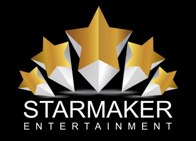
starmaker2.jpg [ 397.28 KiB | Viewed 23575 times ]
|
_________________
Electro-Voice Evolve 50... Taking Sound To The Next Level.
|
|
| Top |
|
|
|
RLC
|
Posted: Tue Mar 10, 2020 8:35 am |
|
Joined: Thu Jan 18, 2007 6:30 pm
Posts: 1803
Images: 0
Been Liked: 629 times
|
DannyG2006 wrote: My company name is StarMaker Entertainment not Star Maker Entertainment. One word. It's how I am listed in PEP's certification area. So in this case. I am right and you are wrong. Oil will admit that despite the error of my company name, Alan's looks good.
It's just a trademark issue.
And just capitalizing the S and the M looks better to me. I hate the all Caps. Danny, Danny, Danny....your logo IS TWO words and IS ALL CAPS both of which you claim you don't like or want...then why do you you have it as TWO words and ALL CAPS In case you don't remember what YOUR LOGO looks like here is YOUR LOGO you posted. download/file.php?id=5240&t=1
_________________
Music speaks to the heart in ways words cannot express.
|
|
| Top |
|
|
|
DannyG2006
|
Posted: Tue Mar 10, 2020 8:41 am |
|
Joined: Sun Nov 27, 2005 11:31 am
Posts: 5355
Location: Watebrury, CT
Been Liked: 397 times
|
|
Here's the fixed logo.
| Attachments: |

STARMAKER-1.jpg [ 22.65 KiB | Viewed 23573 times ]
|
_________________
The Line Array Experiment is over. Nothing to see here. Move along.
|
|
| Top |
|
|
|
Lonman
|
Posted: Tue Mar 10, 2020 10:20 am |
|
Joined: Mon Dec 10, 2001 3:57 pm
Posts: 22975
Songs: 35
Images: 3
Location: Tacoma, WA
Been Liked: 2126 times
|
|
The bottom line is not centered.
_________________ LIKE Lonman on Facebook - Lonman Productions Karaoke & my main site via my profile!
|
|
| Top |
|
|
|
Alan B
|
Posted: Tue Mar 10, 2020 10:30 am |
|
Joined: Sun Jul 30, 2006 7:24 pm
Posts: 4438
Been Liked: 1048 times
|
Lonman wrote: The bottom line is not centered. Nothing is centered except for the star graphic. Danny, it looks ridiculous. And your line on the bottom is so stupid. And the font you used just doesn't work. All in all, a very amateurish job.
_________________
Electro-Voice Evolve 50... Taking Sound To The Next Level.
|
|
| Top |
|
|
Who is online |
Users browsing this forum: No registered users and 505 guests |
|
You cannot post new topics in this forum
You cannot reply to topics in this forum
You cannot edit your posts in this forum
You cannot delete your posts in this forum
You cannot post attachments in this forum
|
|